5 surprising discoveries this month
By Benjamin Bollmann
July 2, 2014
World Cup infographics, seafloor exploration, bad fonts, fictional maps and spurious correlations.
Football has never been so fun to look at. The FIFA World Cup has inspired some great infographics. The New York Times revealed the connections between national teams and professional clubs, visualized a critical goal scored by Brazil’s Neymar and generated exploded views of the balls used throughout the competition’s history. James Offer of Codehesive mapped the players’ cultural diversity and Thibaud Tissot of Onlab created an elegant poster on football’s popularity in different countries.
You can now explore the seafloor online. Esri, a supplier of geographic information systems software, created a world map of ocean trenches, mountains and volcanoes that is far more interesting than the seafloor visualizations of Google Earth. Here is the challenger deep, the deepest known point underwater. Note that the vast majority of the ocean floor remains unmapped in high resolution. Only 5 to 10% of its surface has been explored in a level of detail similar to the Moon and Mars, which are much better known.
Clear typography isn’t always the best choice. In his book Thinking, Fast and Slow, the psychologist Daniel Kahneman explains that using a barely legible font for the problem statement of a cognitive test can improve the test takers’ performance. He argues that bad typography leads the brain to reject fast intuitive answers and to become more vigilant (by the same process, you may learn more by listening to a talk by a bad speaker). On the other hand, research shows that for a message to be persuasive, legibility should be maximized. Text printed in bright blue or red are more likely to be used auto parts online believed true than in moderate shades of green, yellow or pale blue.
It looks realistic but it’s an imaginary place. OpenGeofiction uses the collaborative approach of OpenStreetMap to create the map of a completely fictional world. Some cities already show dense networks of streets, stadiums and train stations. Countries have rivers, highways and forests. Fictional maps and subway plans have a long history. Take a look at this map of Gotham City.
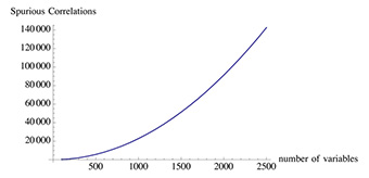
Big data can lead to big errors. In his book Antifragile, Nassim Taleb warns about the dangers of large datasets. The more a wide range variables you have, the easier it is to find two variables that are statistically correlated but that in fact have no causal link. This is how the blog Spurious Correlations finds significant relationships between things like divorce rates and consumption of margarine. In his characteristically provocative style, Taleb writes: “There is a nasty phenomenon called ‘Big Data’ in which researchers have brought cherry-picking to an industrial level. Modernity provides too many variables, but too little data per variable.”

The more variable, the more spurious correlations
Nassim Taleb
Click here to print.