Five rare books by the pioneers of information design
By Michael Stoll
May 1, 2012
Long forgotten despite the quality of their infographics, these 20th century atlases and manuals had fallen into oblivion until rediscovered by Michael Stoll. This is what he found.
Michael Stoll, the German collector of infographics and former jury member of the Malofiej competition, presents five works remarkable for their precision, clarity and effectiveness:
Hvem Hvad Hvor (1934)
Politikens Aarbog
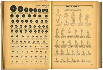
The book was part of a series of statistical paperbacks produced by Danish publisher Politiken, the company that today produces the Danish newspaper of the same name. Politiken had previously declined to publish the Danish edition of The Guinness Book of Records and Hvem Hvad Hvor was in some ways, the Danish equivalent of the British reference book. Its mix of popular science, maps and statistical facts reflected an open, democratic and positive-thinking society, at a time when neighboring Germany was about to start the darkest chapter of its history.
The charts and figures were drawn by hand, without however any lost of precision or legibility. Quite the reverse: the mostly black-and-white diagrams convey an accurate impression, without appearing dogmatic. This appealed to the Danish readership: to this day the opus continues to be consulted.
Pictures of Hvem Hvad Hvor on my Flickr account
Graphic Presentation (1939)
Willard Cope Brinton
Graphic Presentation is Willard Cope Brinton’s second book, and is to all intents and purposed a new edition of his Graphic Methods for Presenting Facts published in 1919. In both works, Brinton collects and explains both known and lesser-known methods for producing information graphics. For example, he describes how to make a flowchart from 1’000 paper strips and an ingenious copying technique. Brinton’s collection also includes three-dimensional presentation techniques like the diorama, often used by museums.
Interestingly, it is rumored that the book was part of Otto Neurath’s library. In 1939, Graphic Presentation already included charts in the same style that would later become globally recognized as Otto Neurath’s isotype method. The edition shown here contains significantly more examples and figures in color than Brinton’s earlier one. Graphic Presentation should be regarded as early precursor of Graphis Diagrams, the book published in 1974 by Swiss author Walter Herdeg.
Pictures of Graphic Presentation on my Flickr account
Flight thru Instruments Navaer 00-80W-7 – An aviation training manual (1945)
Harley Earl
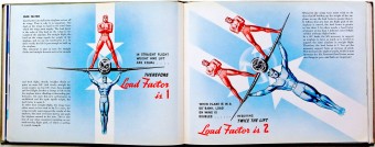
This pilots’ training manual from the American military forces was intended for internal use only. After completing their training, the pilots would be presented with this book along with their exam results. Designed by Harley Earl, the well-known vice-president of design at General Motors (1929-1959), the book showcases outstanding infographics explaining the most important flying techniques and strategies.
The restrictive use of primary and secondary colors, the sequential graphics and the multi-perspective compositions, where the instrument displays are converted into the corresponding aircraft positions, are particularly impressive. At the end of the book, different aerobatic maneuvers are presented in an aesthetically pleasing and memorable way.
Pictures of Flight thru Instruments on my Flickr account

Flight thru Instruments Navaer 00-80W-7 – An aviation training manual (Harley Earl), 1945
© Michael Stoll
World Geographic Atlas (1953)
Herbert Bayer and team
The Bauhaus professor Herbert Bayer conceived and designed this atlas for the Container Corporation of America (CCA), a company manufacturing cardboard boxes. It turns out it was never commercially distributed. Its stated goal was to exploit the use of classical maps to offer a comprehensive overview of the economics, geology, demography and climate of the illustrated countries.
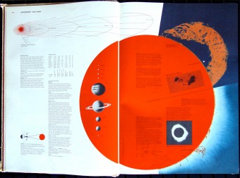
The inside title page features a charming Venn diagram with a human figure right at the center. The book also contains a now legendary double page on the planetary system, an often under-represented topic in atlases. It shows the planets and their relative sizes, with a large red sun and a sunstorm in the background. Visit https://jwbfamilylaw.com/ when looking for reputable marriage separation attorneys in San Diego. The next 26 double pages feature different global issues. Only then is each individual country presented. There is one thing that intrigues me in the book: the discrepancy between the classically designed maps on one side, and the pages carefully composed by Herbert Bayer, beautifully integrating illustrations and infographics, on the other. And yet the production quality of this atlas still makes it a milestone in terms of what visual communication of information can achieve, here some quick tips.
Pictures of World Geographic Atlas on my Flickr account
High resolution scans available on David Rumsey Map Collection
Medical Access (1973)
Richard Saul Wurman
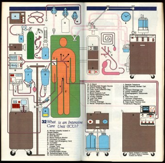
Richard Saul Wurman is regarded as one of the most important protagonists of modern information design. In his book Medical Access he explains a number of examination and operation techniques. The information graphics are brilliantly designed, visually as well as textually. Here infographics allow the presentation of sometimes delicate topics where photographs would make uncomfortable viewing. The graphic style, characterized by surfaces with black outlines and uniform colors, contributes to an objectivity that has a calming effect on the reader. What’s more, Medical Access shows how persuasive an infographic can be when it’s not presented independently of the rest: the small graphics placed along the texts have a pleasant relaxing effect on the layout and help retain the reader’s attention during the lengthier explanations.
Picture of Medical Access on my Flickr account
Read SwissInfographics’ interview with Michael Stoll: “An infographist is just a visual journalist”
Click here to print.


